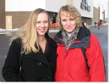
Isn’t this wonderful? And it’s all of the work of my sister, Heidi! She’s such an awesome builder. I was just with her on Friday & we took this photo.
It was time for change & we’ve been working on this for a few months because:
- the red has served it’s purpose, but people were tired of the photo
- it was great for branding though
- I needed something more professional with new branding
- I wanted to make it easier to access my resources – see tabs
- my speaking engagements deserve highlighting
- and after a year it was time for a change!
A quick tour around:
- The blog is still a WordPress blog which my sister magically made to feel like the rest
- The rest of the site is Joomla & pretty cool. I can easily edit it
- There are forums with a private area for Community people to discuss life privately
A couple of cool features here on the blog – there are two sets of tabs that save a lot of space. My sister tweaked the CSS so they highlight when you mouseover them.
And today I saw a very cool way to continue to build my Twitter community and help all of you connect with people who comment on my blog.
- When you comment, you can add your Twitter name – I put in an example below
- Then it is turned into a hyperlink for others to connect to you with!
- Leave a comment & try it out! Here’s the plug in so you can have the same coolness.
- A friend said that @jowyang & @ChrisBrogan should use it to make it easier to connect with their community. It’s a great idea guys!
I’d love to have your feedback on the redesign. Suggestions? It’s never done. And my sister has redone many blogs including that of Sean O’Driscoll & Mari Smith. You can find her at SolutionsByHeidi.com


You can connect with me on Twitter here & to all of those that leave their Tweet names!
I’m glad to see Andy’s Twitter plugin in action; I have a different Twitter plugin on my blog.
Speaking of which, I’d love for you to visit my blog… you might enjoy it! (I also wrote a blog post yesterday indicating 15 WP plugins I love, which you might get some pointers from.)
Joomla and WordPress combined. That’s an interesting combo.
[…] How can I get rid of both the bird and the pre-existing line? I’d like it to look closer like this comment thread on Connie Bensen’s blog. How can I emulate that with Thesis and your above directions? Thanks […]
OK, Connie, you inspired me to change Twitter plugins. I need to tweak it still, but you proved Andy’s plugin was working, so I went ahead too.
Hey Ari,
I’m glad that you found it helpful! I really like it.
I’ll have my sister leave a note with how she was able to make it display like it does. (I didn’t want the plug in showing a bird or saying – Follow me on Twitter. Which are the two options).
Connie, the blog looks great. Your sister did a great job and I may be in contact. The only thing I would add is the Subscribe to comments plug-in. That is my fave.
Great Job.
Keith
Connie! The blog looks fantastic!
Glad to see it up and running and what a great resource with the forum.
Congrats!
Great job on the redesign. This is much more fluent than the last setup you were rockin. The blue is softer and everything is more organized. Great work!!
P.S. I love the idea of including twitter in the comments
This is wonderful Connie.
Nice work Heidi!!!
Жаль, что праздники ушли. Отличная запись. Отличный блог.