Last week I began my position with ACDSee as their Community Manager. I have so many ideas for engaging past, present & future customers. And now I’m excited to have the opportunity to join in making our website more relevant by adding educational aspects to it. I agree that the corporate website should be the source for purchasing, but I believe that it can be so much more!
Why I am I so excited about an educational focus?
It’s because ACDSee makes creative software and I believe that people need to see it dance. There is a saying that I’ve heard in various forms…
- Tell me.
- Show me.
- Let me try
Traditional marketing has the first one covered & we offer 30 day trials, so the third is covered, but the second one is what connects it all & makes the product useful & meaningful.
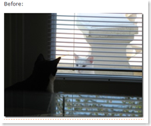
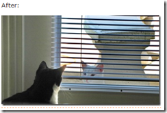
The ACDSee blog is a great venue for showcasing the capabilities in little bits. This photo is my favorite example showing the power of the tools (you have to admit it’s incredible!).
But my sister & I know that users prefer to serve themselves. We have spent a lot of time maximizing DigiScrapInfo.com in terms of usability. Our visitors have at least 3 paths to find information. We offer tutorials in many formats: html, pdf, & video. We’re considering offering the option to order them in a bound book because people refer to their printouts as the ACDSee bible. (We’re won’t use that name though).
What are your thoughts & ideas on this? What do you hope to find when you visit a product website?


* Tell me.
* Show me.
* Let me try
So TRUE! We got the people on the site alright, and we allowed them to download for trial. Then I found out from feedback, they are confused on what to do after they download it.
Past 2 weeks, I have been busy working to create some video software demos, to eventually put up on the site. We have a site selling jewelry software. We basically want to highlight the features, and get people into discussion mode.
Hey David,
Your breaktime at work in Singapore is going to do me in! I enjoy these ‘late night’ discussions!
You just made me realize a huge extension of this – in terms of web strategy a goal would be to make the community platform such that the videos are in an environment where discussion is fostered. I will blog on this & explain further! You just inspired some great insite! thanks!
Being a Content Developer, I am in complete agreement about the ‘educational focus’
– Tell me
– Show me
– Let me try
These are the different methods people use to learn.
The power of the web really allows you to utilize these different methods for showcasing your features and functionality. Being able to watch a video, and then try it yourself is a great way to help people understand your product.
It sounds like you are on the right track, and I am looking forward to how you will be implementing this.
Yes Thomas the resources need to be front & center. We’re going to look at all the options we have for communicating with customers. It’s a big project!